
The South African local election results have been finalised.

This presents an opportunity to demonstrate the importance of both presentation and storytelling to understanding data.
Using data sourced from news24.com I have taken a simple look at the performance of the top 3 parties from 2016 and 2021 (data sourced from News24) using three different approaches.
- Raw numbers shown as a table
- A line chart – showing a trend
- A bar chart – again showing the difference between value
Which approach is the easiest for you to understand?
Does a combination of approaches work better?
What other ways could you represent the same data, but tell a better story?
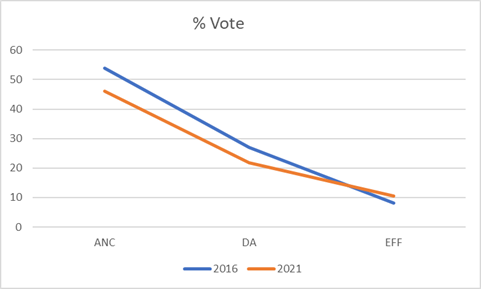
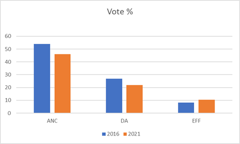
Total Share of Vote
Both of the two largest parties, the African National Congress and the Democratic Alliance lost support, while the Economic Freedom Fighters made modest gains.
The raw numbers are shown below as percentages
| % Votes | 2016 | 2021 | Difference |
| ANC | 53,91 | 46,04 | -7,87 |
| DA | 26,9 | 21,84 | -5,06 |
| EFF | 8,19 | 10,42 | 2,23 |
Shown here as a line chart – we can see the trend.
And finally, a stacked bar chart
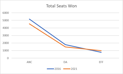
Total Seats Won
Again the two largest parties lost ground, with the third placed EFF making moderate gains.
| Total Seats | 2016 | 2021 | Difference |
| ANC | 5163 | 4549 | -614 |
| DA | 1782 | 1494 | -288 |
| EFF | 761 | 982 | 221 |

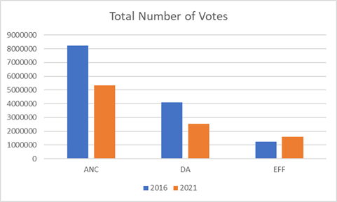
Total Votes
A number that does not seem to be very much discussed, and which to me is possibly the most interesting – the two larger parties lost a huge number of individual votes, whilst the EFF gained a relatively small number.
| Votes | 2016 | 2021 | Difference |
| ANC | 8243281,062 | 5320319,786 | -2922961,276 |
| DA | 4113230,58 | 2523800,698 | -1589429,882 |
| EFF | 1252318,158 | 1593303,444 | 340985,286 |

Telling the story
The raw numbers and charts shown are now open to interpretation.
It is clear that this was a low turnout election, and that the African National Congress lost substantial support.
The Democratic Alliance and Economic Freedom Fighters are both arguing that they had good results, but do the numbers support this?
In a low turnout election the DA was projected to do better than it may have done with higher turnout.
Yet, in fact, over 15 million voters that voted for them in 2016 did not do so in 2021. Equally, they failed to win support from the nearly 30milion disillusioned ANC voters who did not support the ANC this time around.
Similarly, the EFF failed to capitalise on the devasting results for the big two.
Smaller parties – including ActionSA, the Inkatha Freedom Party, the Freedom Front + and the Patriotic Alliance all made modest gains. But many voters simply stayed away.
The reasons for this are buried in data somewhere – but are we looking?
What story can you tell by looking at the numbers?
Please share your visualisations, and interpretations in the comments below!

Leave a comment