
It’s a couple of days before the end of 2015.
A momentous year for some, and a testing year for others – think Syrian refugees and many more less privileged than yourself.
Enough big data for one year – instead, I have chosen to focus on some really small data and show case the value of data visualisation and storytelling.
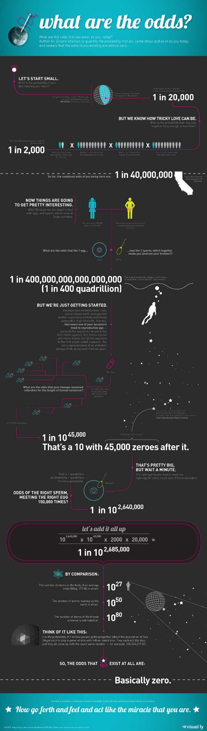
This great infographic, by Ali Binazir, seeks to quantify the odds against each of us existing, in our current form:
And with that in mind – have a great and productive 2016. Thanks for reading every one.

Leave a reply to Bowie Muyutu Cancel reply